Agency experience
21GRAMS
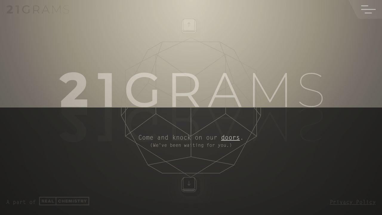
This personal 2023 remake revisits a 21GRAMS concept I helped shape as Director of Experience, pairing its Essence-and-Craft story with smoother transitions, complete navigation, and keyboard interaction.
- Role
- Director of Experience (original concept) · Independent design and engineering (remake)
- When
- 2023—2024 remake
- Built with
- SvelteKit · Rive · TypeScript
The context
21GRAMS was a newly rebranded healthcare agency looking for an identity that felt exclusive, mysterious, and genuinely consequential. The attitude behind the work was deliberately provocative: healthcare matters more than sneakers, so its agency should not look or behave like another fashion-led creative shop.
Finding the soul of the idea
The name draws from the story of an experiment that attempted to measure the weight of the human soul. During the agency's early brand research, I connected that idea to sacred geometry and the Platonic solids. The team developed a world divided between Essence and Craft: light and dark, soul and material, ascent and gravity. We used the dodecahedron as a recurring symbol for the soul.
That thinking shaped an ethereal, otherworldly web concept in which navigation was spatial and the transition between pages carried as much meaning as the pages themselves.
The original site and the remake
An external development team built the agency's original public site. I never felt its implementation fully delivered the concept: transitions were choppy, navigation lacked a complete menu, keyboard movement was absent, and accessibility had not been treated as part of the experience.
In January 2023, I independently rebuilt the site as a personal design-and-engineering study. The remake was never adopted as the agency's public website. It is an archival portfolio artifact that asks what the original concept could feel like with smoother movement, clearer navigation, on-screen directional controls, arrow-key navigation, and more accessible interaction.
Making movement feel continuous
The strongest part of the remake is its page-to-page flow. Svelte keyed blocks let each route enter and leave as part of one continuous environment rather than a collection of disconnected pages. The visible arrows and keyboard controls use the same directional model, while a conventional menu gives visitors a direct route when they do not want to explore spatially.
Building it became a focused study in Svelte transitions, keyed blocks, and keyboard interaction. The measure of success was not traffic or conversion—the site was not a public launch—but whether the original Essence-and-Craft idea finally felt fluid in use.
What I owned
As Director of Experience, I contributed to the original brand research, introduced the connection between the 21GRAMS story and sacred geometry, helped shape the Essence-and-Craft concept, contributed to the color story, and supported the broader brand work.
For the later remake, I designed and built the complete web experience. I cleaned up and animated the Platonic-solid artwork, but another 21GRAMS creative originally drew those forms in Illustrator. The site's copy was also created by the agency team, not by me.
The system behind the work
21GRAMS Rule of 21
A spatial editorial system built on a seven-pixel cadence, the signature Rule of 21, and two complementary visual realms.
-
The Rule of 21
Seven is the base spatial step; twenty-one is the signature unit for geometry, rhythm, and motion.
-
Two realms, one system
Craft is dark and material while Essence is light and reflective, with shared roles that invert cleanly.
-
Tactile restraint
Fine offset borders, paper tones, condensed headings, and deliberate motion create character without excess.
-
Navigation is spatial
Directional movement is part of the experience while routes remain keyboard-operable and semantically linked.
-
Legibility outranks numerology
The rule guides the work, but accessibility and content fit always have the final word.
Visual fingerprint
Identity, components, and proof.
A curated view of the system’s real foundations and state coverage—not a second documentation site.
Foundation
Semantic color
- Near black
#191817Craft canvas and primary ink
- Charcoal
#373838Dark realm depth
- Muted charcoal
#4b4b48Supporting dark text
- Paper
#fffcf2Essence canvas and inverse text
- Warm paper
#d4cebaSubdued surfaces and detail
- Aged paper
#aca795Muted inverse text
- Focus umber
#7a4300Visible focus on light surfaces
Foundation
Typography roles
- Display and headings Roboto Condensed
A compact voice for oversized statements and directional interface language.
- Body and utility Letter Gothic Std
A measured mono voice keeps navigation, labels, and supporting copy precise.
- Editorial quotation LTC Bodoni 175
A reflective serif introduces warmth and contrast inside the geometric framework.
Inventory
Representative components

KeyArrow
A directional control makes spatial movement visible while retaining a conventional interaction contract.
- Rest
- Focus visible
- Active
Nav
The shared navigation maps routes to cardinal directions and remains operable by keyboard.
- Closed
- Open
- Keyboard
TextAnimated
Staged editorial copy supports cinematic pacing without withholding content when motion is reduced.
- Reveal
- Complete
- Reduced motion
In the product
System at work

Decision propagation
One system moves between two realms
The same seven-pixel cadence, condensed voice, and spatial navigation hold together the dark Craft experience and the light Essence experience.
Native controls, 49px targets, visible focus, semantic links, and reduced-motion behavior protect the experience; full cross-realm contrast automation remains an active gap.
More selected work
Elsewhere in the portfolio