Brand and web system
Grande Burrito
The concept translates Grande Burrito's logo and printed-menu style into a motion-led SvelteKit site with a practical Sanity editing system.
- Role
- Independent research · Digital design · Content system · Engineering
- When
- 2026 · In progress
- Built with
- SvelteKit · Sanity · TypeScript · Playwright
The premise
Grande Burrito is a restaurant in my town whose food I already enjoy. Its web presence lives primarily on social media, and I saw an opportunity to give the business a more professional home while making its most important piece of information—the current menu—much easier to find.
This is a self-initiated concept. It was not commissioned by Grande Burrito and has not been presented to or approved by the restaurant.
Researching the existing voice
I reviewed the restaurant's Facebook presence, the way it communicates with customers, its posted menus, and public Google reviews. Rather than inventing a replacement identity, I treated the existing logo and printed-menu style as the source material for the site.
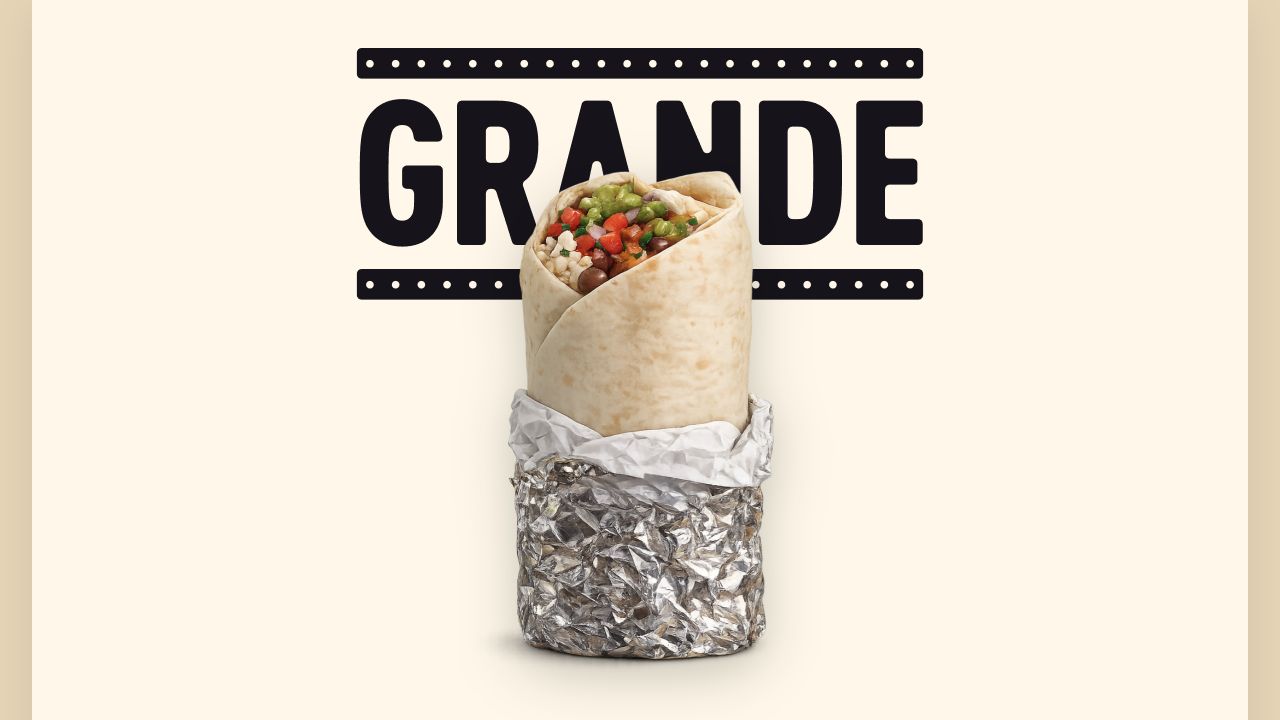
The digital expression adds a stretched Grande wordmark, a motion-led logo treatment, clearer hierarchy, and a dedicated structure that social posts cannot provide. The animated logo is the detail I am proudest of in the current build.
A site the owner could run
The public experience is paired with a Sanity studio for maintaining menu categories, items, prices, sold-out states, regular hours, exceptions, announcements, imagery, and supporting copy. The expressive homepage hero remains locked so routine content editing cannot accidentally dismantle the central brand moment.
A generated content snapshot can preserve essential public information during a CMS outage. For this speculative build, that resilience is proof of the feature and of the production thinking behind the concept—not a requirement supplied by the restaurant.
Honest placeholders
The burrito image in the current hero was generated with ChatGPT as a temporary visual placeholder. It is not presented as a photograph of a real Grande Burrito menu item. An official version would replace it with photography of the restaurant's actual food.
Current status
I researched, designed, and built the working frontend, content model, Sanity studio, validation rules, and resilience layer. Before presenting it as a real proposal, I would simplify the administrative interface, continue refining the motion, add a printable menu for customers who want to keep a copy at home, and replace the placeholder hero image with original photography.
What I owned
This was an independent end-to-end exercise spanning research, product strategy, content modeling, visual and interaction design, animation, frontend engineering, CMS architecture, and testing. The restaurant retains ownership of its existing identity; my contribution is the digital system built around it.
The system behind the work
Grande Burrito Sign & Sheet System
A sign-led, menu-sheet-inspired system that keeps restaurant decisions clear and resilient.
-
The sign is the anchor, not wallpaper
Brand cues establish identity without competing with operational information.
-
Operational facts come first
Hours, menu, phone, and directions remain useful through degraded states.
-
Borrow the menu's rhythm, improve its scan
Printed-menu character is translated into accessible digital hierarchy.
-
Build resilience into the default
Accessibility, responsive content, and service failure are first-class states.
Visual fingerprint
Identity, components, and proof.
A curated view of the system’s real foundations and state coverage—not a second documentation site.
Foundation
Semantic color
- Sign ink
#17141cBrand field, text, and focus
- Sign tan
#a6855fObserved storefront identity
- Paper
#fff9ecPrimary sheet surface
- Warm paper
#ead9bcSubtle operational panels
- Deep paper
#d3b483Surface emphasis
- Muted ink
#594a3eSupporting copy
- Rule
#aa9578Menu dividers and boundaries
Foundation
Typography roles
- Brand Anton
A self-hosted condensed face reserved for the sign-derived mark.
- Display Georgia
Brings printed-menu character to food-led headings.
- Body and controls System sans serif
Keeps hours, prices, actions, and operational copy fast to scan.
Inventory
Representative components

BrandMark
A responsive reconstruction anchors the identity while its provisional provenance stays explicit.
- Responsive
- Accessible label
- Provisional
MenuItem
Menu rows preserve pricing and availability detail without recreating the printed menu’s density.
- Available
- Sold out
- Long content
HoursStatus
Current status, next transition, today’s hours, and exceptions stay answerable together.
- Open
- Closed
- Exception
In the product
System at work
Decision propagation
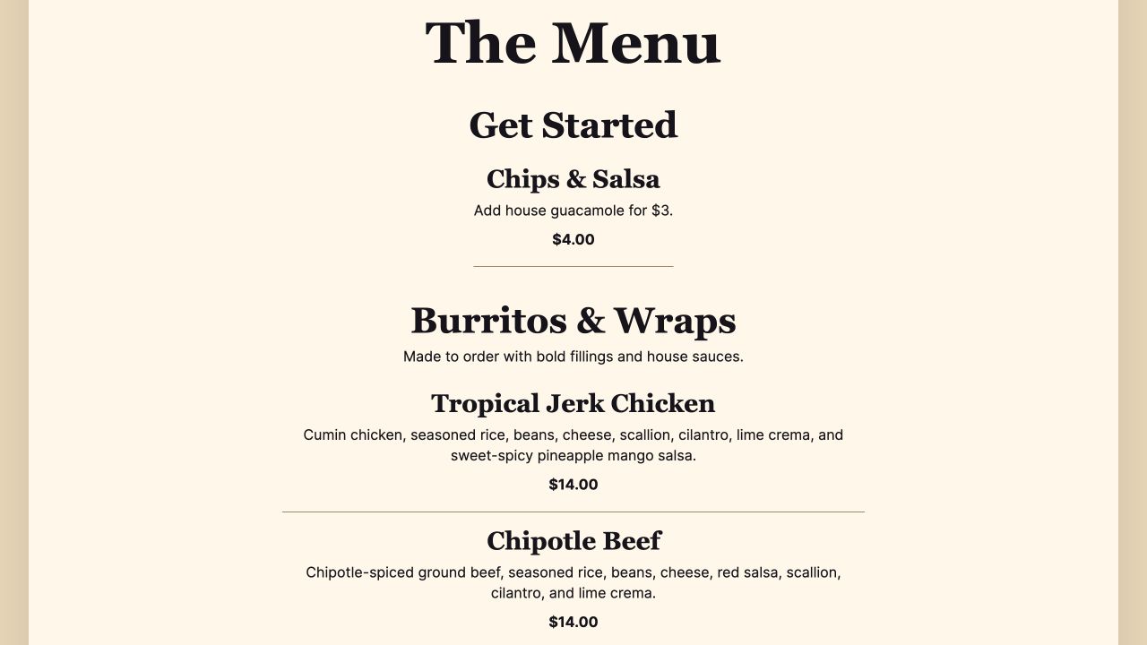
Printed-menu rhythm becomes a scannable system
Food categories, descriptions, and prices use a consistent editorial hierarchy that keeps a long made-to-order menu easy to scan.
The sign pair measures about 5.33:1, actions meet the 44px target, focus remains visible in forced colors, and status never relies on color alone.
More selected work
Elsewhere in the portfolio